OK, I couldn’t sleep this morning so I’ve been playing with some data from @asoong and some ideas from @Etienne
I’m playing with methods to visualise $DPI and the underlying tokens… The goal is to help me understand DPI, and try and get some figures to build into future posts / blogs etc. All the figures below are based not eh same data set and valid. Each is useful in understanding different aspects of the data and telling different stories. However, some are better suited to our purpose than others. Even so I think it’s useful to create and share them so we can see what works in different situations / for different people.
I’m not the worlds greatest at generating pretty graphics (I just use a spreadsheet to create static graphics). I’ll happily let others see what they can do to improve them. I think @Kiba was doing something for a web UI showing DPI value over time, but I couldn’t find it.
My background is a Scientist, with an interest in finance, so any corrections on financial terminology are welcomed. I’ve not reviewed my data in great detail, I think there is some minor errors in the calcs, but overall I think it’s good enough for now.
OK, on to the fun part:
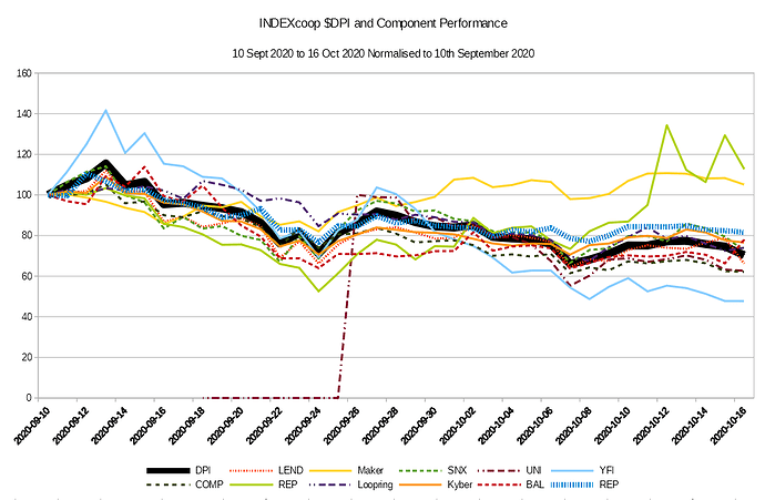
All data is 10th September 2020 to 16th October 2020, UNI joined on the 18th Sept.
The first figure shows the relative performance for DPI and the components . All values are normalised to 100 on the day they joined.
Unsurprisingly this shows that DPI is approximately the average of the group with less volatility than any single member (market cap weightings means that DPI should be closer to the larger componets (Lend, Maker, SNX…)
The second figure shows the volatility vs DPI for each component. It compares the change in an individual token to the change for DPI over the same period. E.g. if DPI drops 10% over the period, but $XXX drops 20%, this figure would show that $XXX had a ~10% drop vs DPI. (or possibly closer to 11% relative…?) [If anyone can give me the correct financial terminology for this I would appreciate it]
This figure is very close to the 1st. However, by removing the total market cap volatility (and emotions for the Hodler) it emphasises the relative volatility of the components and so the beauty of diversification.
Figure 3 shows the contribution of each underlying token in $USD to a single DPI. This is based on the price, and the weighting of each in the Set. Other than a general trend down  , and the addition of UNI, I don’t think there is much jumping off the page.
Figure 4 shows the same information with the components stacked. Compared to Figure 3 it emphasises the DPI value more (~$120 to ~$80). However, I think it is harder to see what the individual components are doing.
Figure 5, is the percentage contribution to a particular days DPI price. Basically, figure 4, divided by the $DPI price every day. As with figure 2, looking at % contribution removes the emotion associated with seeing the DPI price dropping. So this focuses attention on the difference between Tokens over time.
Figure 6 is the % contribution without stacking (unlike figure 5). I think this is better at seeing individual changes (e.g REP kicking on the 12th October), However, it’s not clear that UNI starts on the
Figure 6 is a simple pie chart for the 16th October 2020. This makes it very easy to see the relative contributions from each component. However, there is no historical trends to show whats happening.

Some final comments, This is a very rough draft. I’m sure there are typos in the text. More importantly the figures can be improved in a number ways: All the titles and labels could be clearer, I’ve abbreviated some tokens in ways that the protocols would not do themselves (which could annoy some of the people we want to build bridges with), and figures 1 and 2 use a different colour set to the rest. If I did this at work, it would be returned to me covered in red ink… But for now “Done is better than perfect”
Some questions:
- What do the figures tell you about $DPI?
- Which figures do you find most useful (and in thinking about what)?
- Can you suggest other graphics to help illustrate this data set better?
Google sheet with data please have a play with it and create some new graphics(should be read only so take a copy)
Regards
OA


